Enshrouded

Product Positioning

Sandbox survival action RPG for core gamers

Platforms

PC. Consoles planned

Publisher-Developer

Keen Games

My Contributions

Continuing my central role in Portal Knights, I...

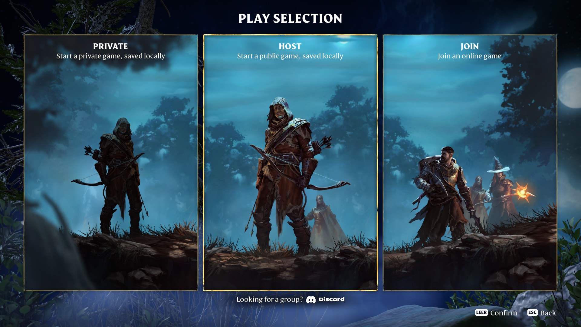
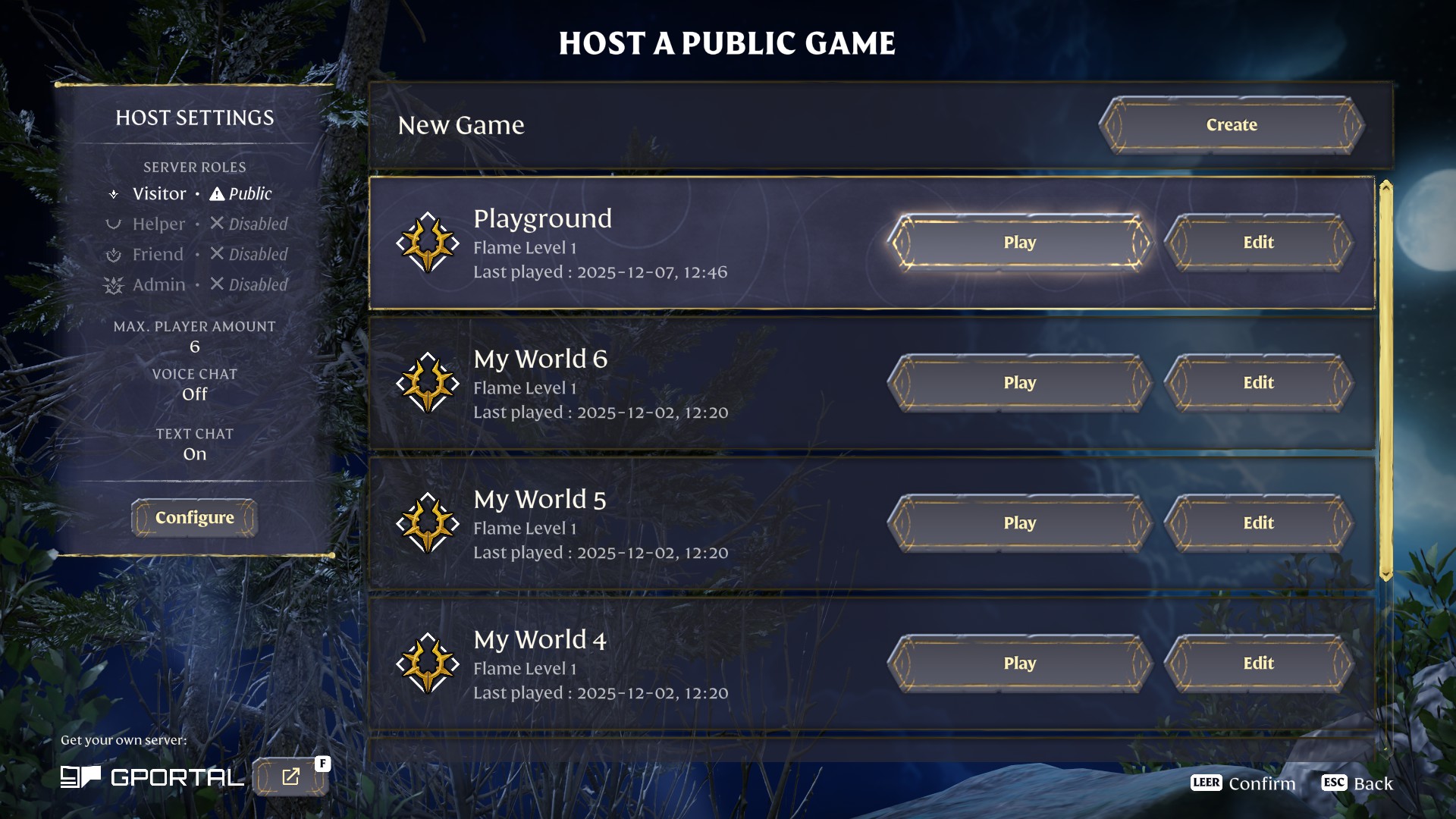
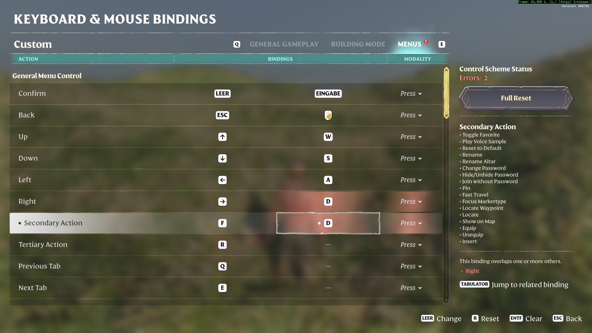
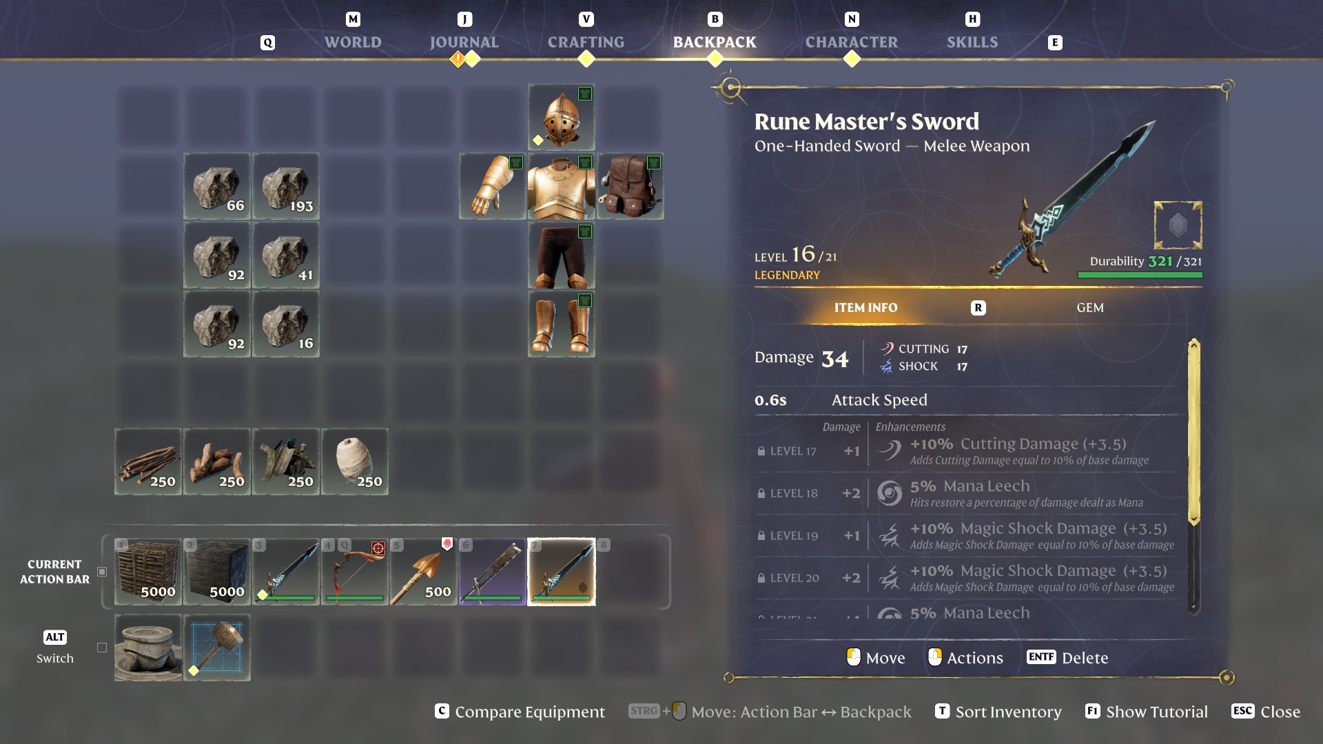
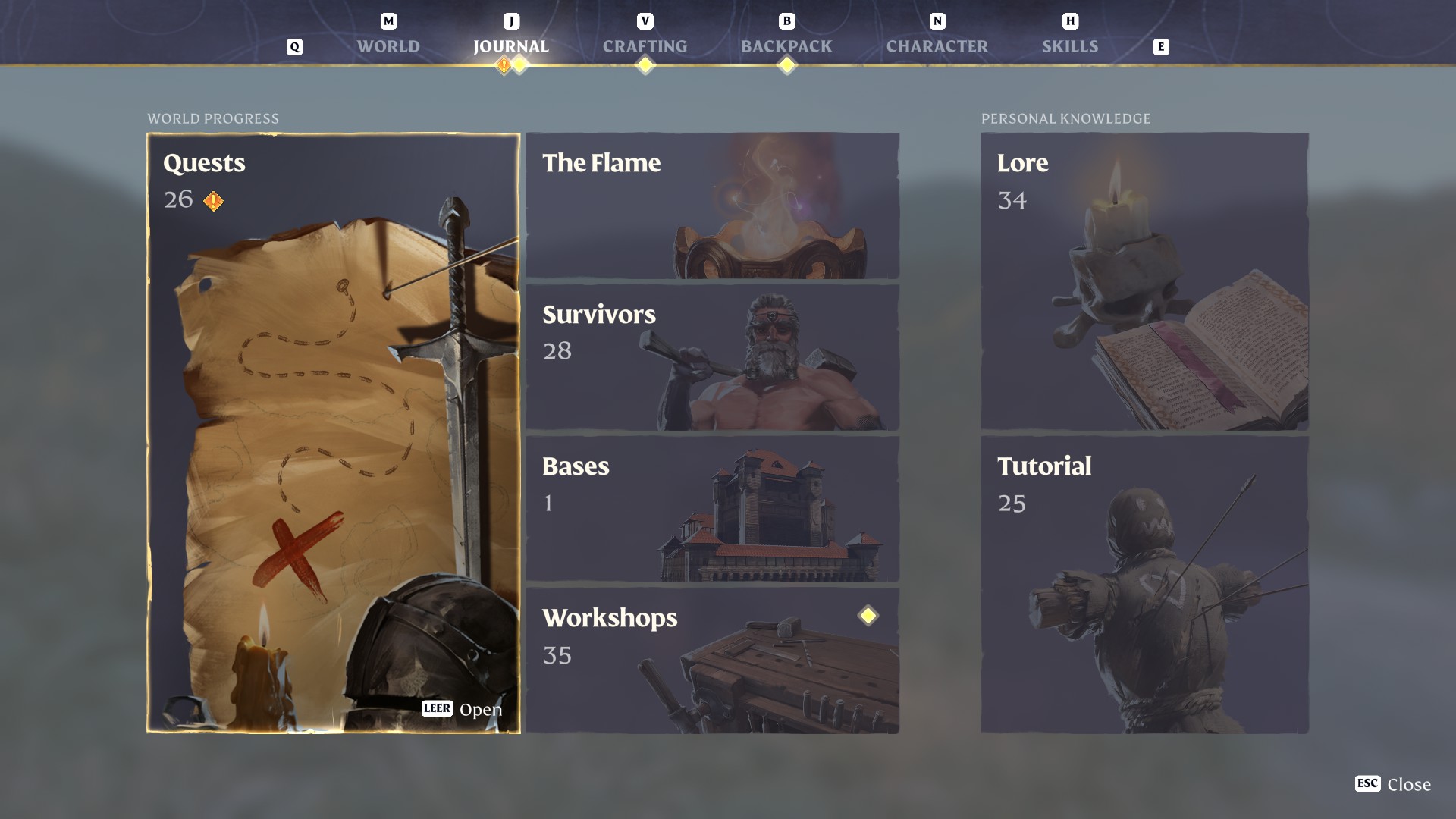
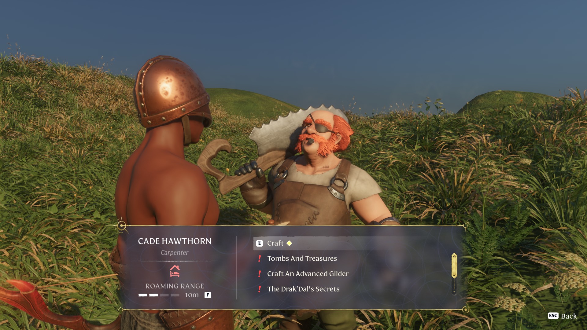
  • Established the foundation of the player-facing UI, starting from the pre-production, including UI art style and typography, all the way to code structures.
  • Continue to design, implement and iterate menu-driven interactions and display elements...
  • ...covering screen flow, layout, texturing, menu and input logic, animations.
  • Continue to enjoy front-end programming in C++ with Keen’s proprietary immediate UI system.
  • Started to serve as a peer-coach in the game UI department that is no longer just my humble self.

Disclaimer

Of course the entire UI is the result of teamwork with intertwined contributions. That said, this presentation focuses on parts that do feature my design and/or execution predominantly.

The Building Menu

Requirements & Priorities
  • Allow quick selection of blueprint items and the materials and offer a discoverable way to explore the entire catalog of blueprints without being overwhelming.
  • Offer building options without pulling out the player to the menu layer more than necessary.
  • Therefore, using a screen-covering catalog for the full shape selection was not desired. Nor was a hierarchical item organization that can easily suck the user focus into navigation the menu levels.
  • Design Part 1: The Base Pattern
  • Since a voxel structure is a main item (the blueprint) filled with a variable dependent item (material), we leverage the familiarity of using a ranged weapon item with variable ammunition.
  • This allows for easy transfer of mental model and muscle memory, and reduces friction between general gameplay and building.
  • Laying out the shapes and the materials on one axis each shows how the aspects logically combine into the resulting voxel structure.
  • Design Part 2: The Expandable Bar
  • The item selection row can be pulled up by holding a modifier input, revealing a multi-row menu where each row is a category.
  • While expanded, move vertically to switch between the categories. Simply release the opening input to return to the single-row item selection within a category.
  • As the menu opening input is a hold modifier key by default, the player doesn’t get stuck in a mode to navigate the categories, making the expanded menu feel more seamless and quick to use.
  • Carefully organizing items into sensible categories is also integral for the design to work.
  • The Crafting Menu

    Requirements
  • Present recipe items visually (not as a list).
  • Allow quick navigation between categories.
  • Support recipe comparison, which informs crafting decisions.
  • Implemented Features
  • A hierarchical directory on the left offering overview and quick jumps between categories, which also functions as category filter.
  • When moving in the directory, the grid view scrolls to show the highlighted category accordingly, and vice versa.
  • The recipe browser can transform into a comparison view, where the grid view shrinks to make space and ineligible items are filtered out.
  • In the comparison view, the directory is minimized to make space. It maintains full functionality: focus it to expand, and the grid shifts gracefully.
  • The Equipment Menu

    Description
  • A classic equipment overview showing the character surrounded by slots and relevant gameplay data.
  • Each slot opens into a browser. In this menu depth, tabbing changed from top-level navigation to changing slots, reducing the need to go back to the overview.
  • A comparison view is also available.
  • Item Handling Usability with the Gamepad

    Split Stack

    Motivation & Concept
  • Offer a way to quickly split stacks without using the full, modal dialog — analog to mouse & keyboard control.
  • Reuse the “grab item”-button as a hold input to add functionality without occupying another precious gamepad button.
  • Implementation
  • Holding the “grab item”-button reveals a half-circle widget at the item, which is used to adjust the amount to take.
  • The radial input with the left thumbstick, which is shown at the center of the half-circle, defines the split being taken.
  • The adjustment snaps to the mid point, so the popular use case of half-a-stack is comfortable.
  • Move Between Containers

    Use Case & Challenge
  • It is often handy to quickly move things between the backpack, the Action Bar, and storage chests, without actually going the steps through the slots.
  • While the mouse can simply use modifier keys (Control and Shift) to effectively target two other containers, on our packed gamepad there was only one button left for this feature.
  • Design & Implementation
  • Instead of multiple actions with a fixed target each, the gamepad action uses an adjustable target direction internally.
  • A simple button press executes the action with the current direction, which can be changed while holding the button.
  • This allows for an easy repeat of the current intention, while still supporting all transfer directions with one button without frequent fiddling.
  • To make the behavior discoverable and the execution feel good, every usage shows the possible directions, and confirms the current one with an animation.
  • Surviving Fog and Water

    Challenge
  • The game’s eponymous fog is, by its nature, visually diffuse, and designed to allow long expeditions with increasing tension.
  • However, this not only makes entering the fog easy to miss, but also the survival time hard to track and easy to forget.
  • On the other end of the urgency scale, the recently introduced water feature also needs its much shorter underwater survival time to be immediately grasped.
  • Design
  • I went with a combination of a literal countdown and a visual bar sectioned into minutes, providing both precision and a visual sense of the general amount, respectively.
  • To make the slow burn more perceivable, cyclic waves visualize the draining direction.
  • The “Survival Meter” is set up to gracefully transition between showing only one resource shrinking as a symmetric bar, or both Fog Resistance and oxygen, each occupying one side of the two-ended bar.
  • Additional Samples